
When one of the leading email marketing platforms builds it’s own lists, do you think it would be a good idea to see how they are doing it?
 They kind of know what works better than anyone, I reckon. So do you think it makes sense to copy their approach?
I sure do.
Below, is a case study of something I saw on a page on Aweber’s site. I was not logged in so it assumed I was not yet a customer. As such, I got to see how they are building their own list of prospects… Golden stuff, right?
This should be very interesting to anyone who is building lists of leads and prospects as there are a few clever things at work here. And you can easily replicate what they are doing (if you have the tools to make it easy, that is).
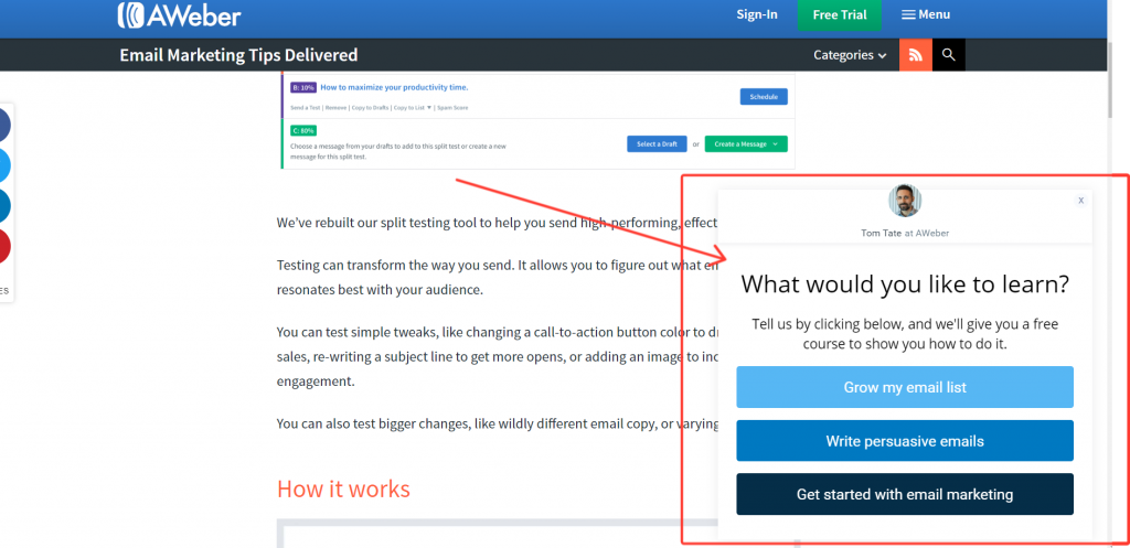
So, the first thing to note is that they are using a nice slide in that triggers at around 25% scroll.
I have seen so many split test results about the optimum time for a box to appear and they all seem to contradict each. probably because it depends on how engaging the content is.
I know I get irritated when I am really interested and concentrating when a pop-up interrupts me. So, in my head, if there is something that people will read to the end, then pop your box later or as an “exit intent”.
I think the key here is that it does not completely cover the content. On a bigger screen than my laptop it probably doesn’t intrude over the content at all but, because it suddenly appears, it is noticed (I tried to screenshot it on my big screen but I was cookied and I had reached the limit of return visits they had set it to show for – more on that later)
If the box can stay, it has more chance of being read and more chance of being clicked when the viewer has finished consuming the content.
On mobile, it is much more “in your face”
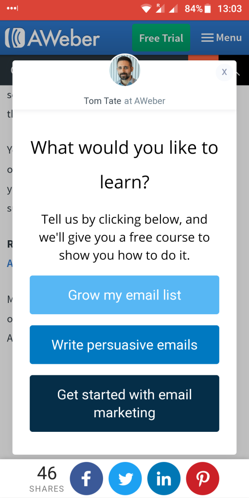
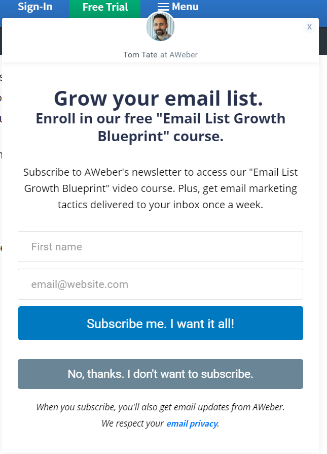
So, let’s have a look at the box itself.
First thing I like is that the author of the post is featured at the top – his photo and his name.

This adds a personal touch – almost like a live chat box. I can understand why they do this and I am sure this is something that they have tested out.
Next is a great headline. It is a classic alternative close.

There is no mention here of any newsletter or list. It is merely surveying the visitors according to what they want. It is a simple question.
The supporting sub-headline is a very simple CTA that is making a superb value offer. Basically, “let us know what you want and we will give it to you – for free”.
This is then followed by three choices. These choices will have been chosen by analysing the most common questions or needs that their prospects have – Don’t forget that Aweber has been doing this for 20 years so it has a pretty good idea of what potential customers may be looking for.
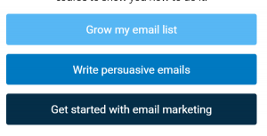
Before we delve into what this is actually doing, look at the choices on offer.
They know that people reading the blog post obviously have an interest in email marketing. What Aweber doesn’t know (yet) is where they are on that journey.
Are they people who have not started, people who have started and want to grow their list or people who have a list and want to increase engagement?
There is a choice for each of those possible categories.
This is called pre-segmenting. They will be added to different lists or tagged with different tags depending on which “entry point” they choose.
All of the follow-up emails and content will be specific and wholly focussed on where they are on their journey. They get the help and information designed to bring them to the point of getting a free trial Aweber account – and the reasons will be different for each of those people.
So newbies won’t be getting emails about the nuances of split-testing or advanced automation and experienced marketers won’t get emails about the beginners’ basics.
Pause for a moment to think about what is happening here. People are segmenting themselves before they have even subscribed.
Do you think that will mean open rates are higher?
Do you think that will mean click rates are higher?
Do you think that will mean click rates are higher?
Of course, they are.
Now let’s have a look at what happens when a visitor clicks one of the buttons. I won’t go through each one as they look similar (obviously with different headlines).
The first (important) thing to notice is that you are not taken off the page you are on. You are halfway through reading the post and you wouldn’t want to be taken away from that to a squeeze page so the opt-in opens in the same space.
Notice how this is fully compliant with all of the GDPR rules without having silly checkboxes or great big disclaimers anywhere. The emails are actually part of the free offer “product”.
I also like the “no thanks” button on there. It shows confidence that they will want to subscribe. If it is clicked, the box simply closes.
The only thing I don’t like is the word “subscribe”. There are better words to use.
The form is only shown on a fixed number of times to ensure that visitors are not bugged by seeing the same thing time after time. You don’t want to irritate return visitors. You could, of course, present them with a different box if they have seen the first one and not taken action.
Here are the takeaways:
1. Make a box appear – the animation catches the eye – but keep it as discreet and professional as possible and personalise it so it appears more human.
2. On a content-rich page try and make it appear so it doesn’t cover up the content completely (you can’t do much about that on mobile, of course).
3. Pre-segment potential subscribers. Give choices and ask them to choose, promising highly tailored free content rather than just blindly asking them to subscribe to a newsletter.
4. Keep the whole subscription process on-page. Don’t redirect to a squeeze page. They came there to read your content, don’t take them away from it!
5. You may want to limit the number of times a box appears to the same visitor. But, if you decide to keep showing it you should at least not show it to people who have already subscribed.
So, you are probably wondering how you can deploy a lead generation system as powerful as Aweber’s on your sites and blogs, right?
Well, I will tell you this. To replicate Aweber’s site using the system that they use will cost you $99 a month (or $999 a year) and that still comes with some limitations.
Want to know a better way?
The software I use does the same job. In fact, I believe it to be more powerful than the one that Aweber currently uses.
You certainly do not need to spend $999 a year for it either!
It is not cheap, but (at the time of writing) it is still in it’s “pilot program” which means that new features are being added prior to the official public launch.
While it is still in the pilot program, you can get lifetime access for a one time fee. That means you are grandfathered in and will never have to pay another cent to carry on using this amazing software (even when others are paying a monthly fee).
The best news is, even for the agency version of this software that carries no limitations, it is less than half the price of just one year of the other platform (which does have limitations, remember).
You can get all of that power on your sites starting today.
Want to know more?
Just click here to go to the private page where you can learn more and secure your lifetime deal
I would love to hear your feedback on this. What do you think about pre-segmenting? Any observations you have just make a comment below.
And if you found this useful, please share it!


Recent Comments